Everything Is In The Details - 11 November 2017
Like every other Ubuntu user, probably, I'm very excited for the prospect of a beautiful new theme for the upcoming 18.04 release. As the distro with the biggest consituency in the Linux user community, I'm very confident that the very best and brightest contributors will be drawn to make their mark on it. Having foisted myself upon a friend who was in desperate need of a website for an upcoming exhibition (his first no less!), I've come to feel like I don't have what it takes to really crack out a top-notch theme.
But that's not going to stop me, or absolutely everyone else it seems, from getting our Extremely Important Opinions in the mix. Leading up to the announcement today, Joey Sneddon of OMG Ubuntu published a top-5 article on his highest rated GTK+ themes for GNOME Shell and applications. Having been a few years since I cared at all about theming my computer, and an equal amount of time since I've been on XFCE, I have had no experience with any of those listed. I'll say here at the top, I've been a Unity user for years, I consider it the best DE for Linux for the no-nonsense functionality, nice features, predictable behavior, and layout. I like the orange and purple, a lot. But Ambiance, the default theme of Unity 7 which had been massaged to work better with GNOME 3 over the summer, is due for an update. It's not the vanguard of user-interface style (though, what is on a desktop or laptop?), and there's a lot of alternatives to consider.
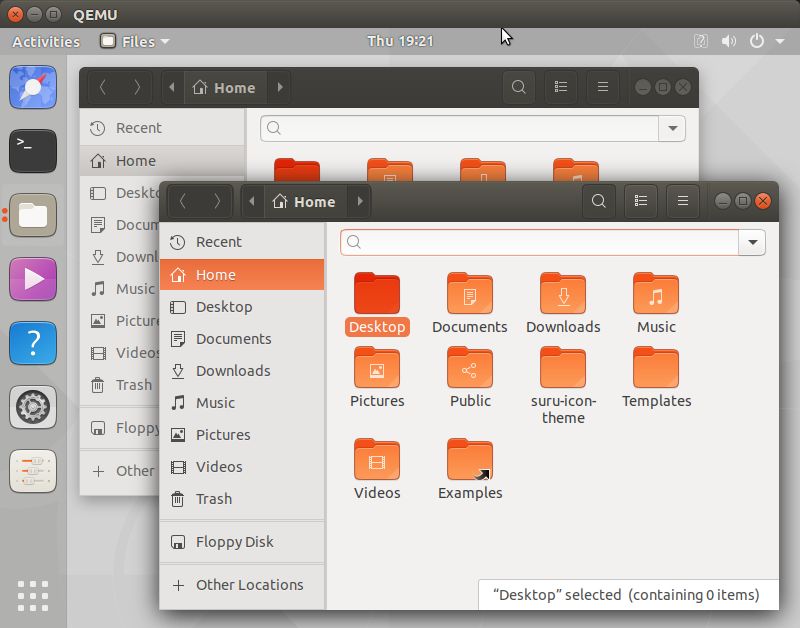
My setup was just a little KVM, installed the themes as recommended in Joey's article, set the desktop background to the grey version of the aardvark to reduce distraction, installed tweak-tool, and took some screenshots. I looked at all the themes Joey posted, and their multivarious versions and combinations, but have decided to only make examples of Adapta, Arc, Pop, and United along with the default Ambiance. This is because these are the names I see come up the most in discussions about alternative themes, and are among the most complete alternatives. I have also decided to only produce examples of the default versions of each theme (with the exception of Arc, kind of by accident) because this visual review is not about whether one color is better than another, but about how each theme functions in communicating with the user.
Focus and Selection State
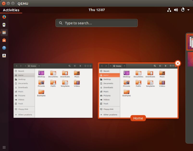
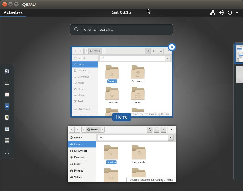
It's actually much more difficult to evaluate these themes comparatively in pictures than with an interactive desktop, but pictures will have to do. As well, it's a bit of a trick to overcome the "oh I like that" effect of first impressions and change. My emphasis for this first collection of images is on how each theme communicates to the user the selection state of your visible applications.
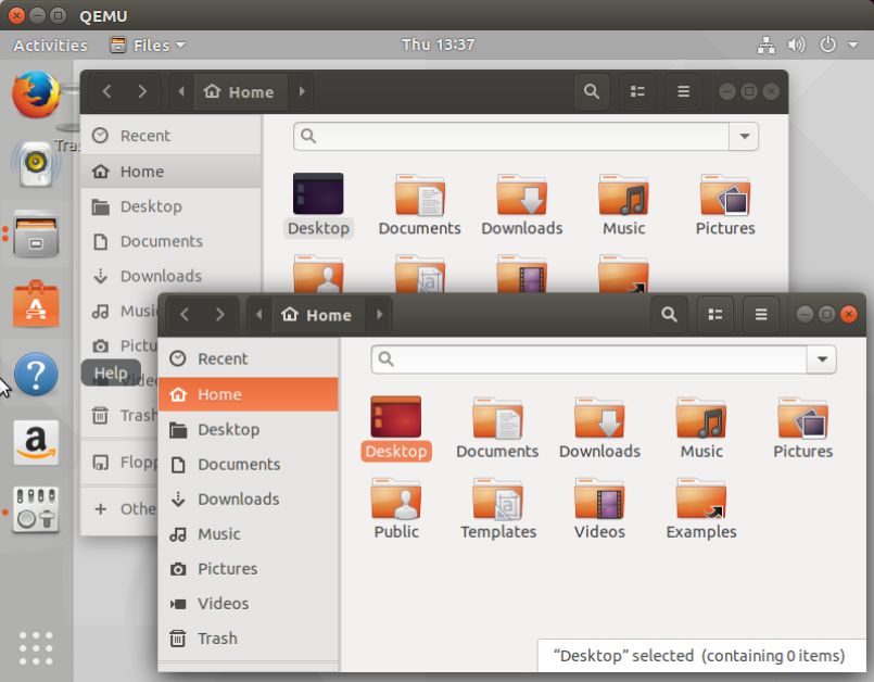
Ambiance is the best here, with a multitude of subtle changes between the focused and background window: greying of the selection highlights and window controls (which also have an alternate hover highlight, couldn't get a screenshot), alternate icon highlight, and alternate header buttons. The other themes have some variation in the window decorators, but only Arc has alternate highlights for window controls, and none have an alternate main highlight color.
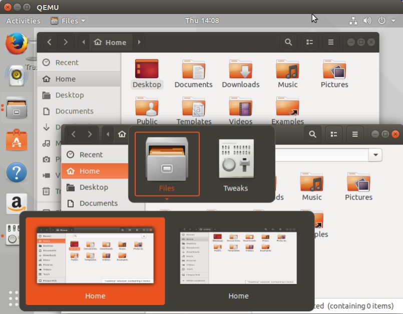
Activities View
All themes have functionally equal styling, other than United which has a problem with highlighting the window title in the preview.
Dock Application Menu
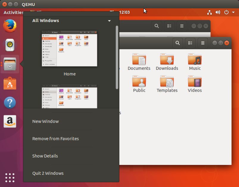
Trying to see past differences like padding and color, there is nothing between these shell themes for the functional quality of the menu itself (unless you have opinions about whether transparency helps or hurts usability). However, in the 'All Windows' selection panel the Arc shell theme does the best job differentiating the active window, with the high contrast close button on the focused window.
Alt-Tab & Alt-Tilde Window Selection
Again, very little between most of the themes which stick close to the default adwaita approach (a single highlight color). The standout for me here is pop, which uses a number of variations in different highlight colors to avoid oversaturating the view. Arc is the worst for this overcolored, all-blue-everything look, along with Ambiance due to the high contrast of the medium grey and bright orange overwhelming with that amount of colored area.
To make this already too long post more useful for others, here's some images of current Ubuntu desktops with Sam Hewitt's Unity8 inspired icon theme. I think it's his best work yet. Unity looks really messed up installed onto 17.10, but I'm sure Unity7 users can use their imagination. Also, there're some images of the GNOME shell default theme, Adwaita, on Ubuntu 17.10 for further comparisons.
Suru Icons
Default GNOME
All the themes here are functional, relatively complete and easy enough to live with. All these themes have some good ideas and do most things well. However, I think whoever ends up in charge of steering the project for a new theme for Ubuntu should try to maintain the attention to detail and functionality packed into Ambiance on the Unity7 desktop, which it does fairly well also on the GNOME desktop. I've got lots and lots to say about specific aesthetic choices I'd make, but that's not exactly helpful if I'm not saying it in a theme or a patch to one I like. Let's all be ready to embrace the change, make positive contributions to and encourage the contributors who will come forward.